
Contributed by S Moffett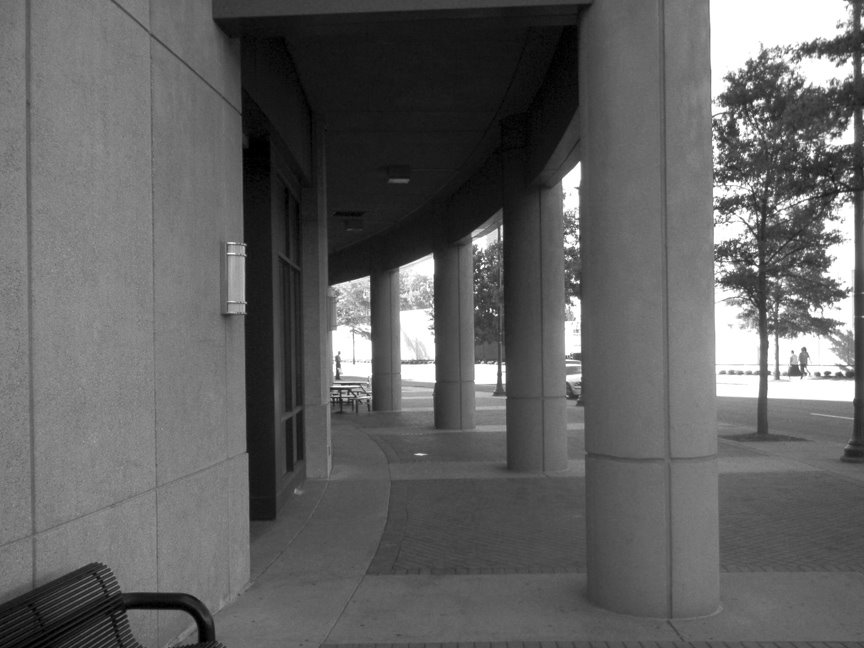
I took this picture outside of a hotel before I went into the photoshop seminar.
I changed it to black and white and did a levels adjustment. I like how the poles give out symmetry
and how the depth synced with it.
Tuesday, October 10
Poles of Symmetry
Subscribe to:
Post Comments (Atom)


8 comments:
I like the composition of the photograph - there is interesting contrast between the negative and positive spaces of the columns and trees.
My concern is the dark value and lack of contrast in the building and column walls. It might be that the texture of the walls create that effect.
-Ferreiro
I like the depth of field in this picture a lot. It really draws me into the picture. Good picture.
I like this picture and the feel of how your eye follows the wall until it bends behind the vanishing point it could be better though if there was another object or a more clear image at the vanishing point
-Liam
i like this picture, and i think it looks very nice. one thing i don't really like is the random bench in the bottom left because it's like it's just there. but overall, i like this shot. it looks really good.
-gillespie
I like the contrast and the amount of openess but it seems to be too empty. I dont know what would fill it but its still a great shot.
Ben Vail
I do like the curve of the roof line as well as the implied curved line created by the repetition of the columns. If these leading lines lead my eye to something interesting I would be sold on your composition. I do agree that the bench in the lower right distracts.
I like the fact that you printed it in black and white. It adds a little bit of drama to the picture.
I like that its black and white. It makes the picture more dramatic. The collums bring you eye throughout the picture.
Jacob Brey
Post a Comment