Contributed by L Crowley
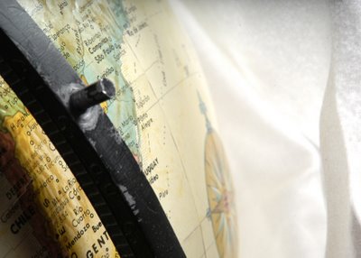
I took this picture about a week ago in the studio. I adjusted the levels and the hue and saturation just a little in photoshop and I cropped in on the globe. I really like this picture because to me there are a good number of little lines that help move your eye around the piece and the velvet cloth in the background enters just at the vanishing point of the globes curves. I really like how they fuse together in the background. I chose the name Real Estate because its cropped in on another country and to me it is mocking the fact that our country is an imperialist nation just looking for some new land.
Thursday, October 19
Real Estate
Subscribe to:
Post Comments (Atom)


4 comments:
I'm not sure i like the background. the white kind of dulls it. you want to look at the globe but your eye moves the white as soon as you look at the picture and there's nothing to look at there. and you can't really tell it's velvet. if it was black, it would bring you back to the yellow and also compliment the lower left corner and that bar. good picture.
~Shelby.
This picture gives me a clue. I agree that the white backround adds nothing to the piece. It almost takes away from the globe. (The backround is blown way out.) I like how you used the rule of thirds by putting the globe off to the side instead of in the center of the picture. But the rule doesn't do much if there isn't something to contrast with the object. I feel no sence of depth because of this. All in all I think it has a lot of potential. And there still is that clue.
I really like this picture, or the idea of this picture. My eye wasn't moving around very much, I was too focused on the black bar. It's a great shot for the rule of thirds, but try and use a darker background next time.
Bomer
love the detail. love the shadow. i just with it wasnt so blown out with the white background at the end.
- c. selman
Post a Comment