
Contrbuted by A Garver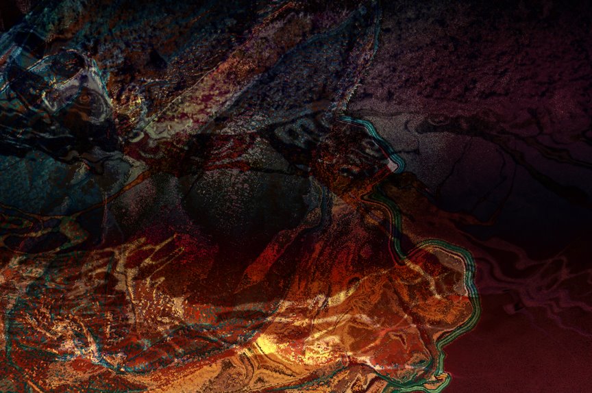
Ok so I know this isn't exactly traditional photography. Part of that is due to my inability to remember to upload some new pictures from my camera. All that aside I do like to take different photos I've taken and create a totally different product with an abstract vibe that resembles painting. I really wanted to bring this image to life by the color variations between warm and cool as well as complementary colors. Second I wanted to create an interesting aesthetic and feeling of texture through the organic lines that guide the eye around the image. I once again used one of my signature technique by putting both of these images in index color mode, uploading different color table and inverting the images and using blending modes on the various layers. I decided to title this composition Amalgamation because it is a combination of two photos with entirely different moods. Further more it reminds me of when you put different drops of food coloring in water and it kind of swirls and create this momentary swirl of varying colors before dissipating. So I kind of feel its capturing a sense of momentary fluidity and interest before becoming mundane.
I could go on but I'll let you judge for yourself I'd be interested to hear your input thanks.
Wednesday, November 1
Amalgamation
Subscribe to:
Post Comments (Atom)


4 comments:
wow, ummm, ok. very different, but I think I like it. I would like to know what the original photo(s) looked like, but very cool it deffinately draws your attention and then makes you do a double take. I really appriciate how i had to look at it to fully obsorb it, very cool.
wow, ummm, ok. very different, but I think I like it. I would like to know what the original photo(s) looked like, but very cool it deffinately draws your attention and then makes you do a double take. I really appriciate how i had to look at it to fully obsorb it, very cool.
upon further examination I think the composition would be stronger if I cropped out some of the right side of the image. ~Abby
I think it is too dark and a bit over done. There really isn't anywhere for my eye to rest. There is nothing that is trying to be the main interest. This may be a result of it being too dark. Also it just looks too digital...while I can tell it is somewhat sophisticated it still looks like a digital abstract that does not have enough wow factor to hold my attention very long
Post a Comment