
Contributed by L Bates 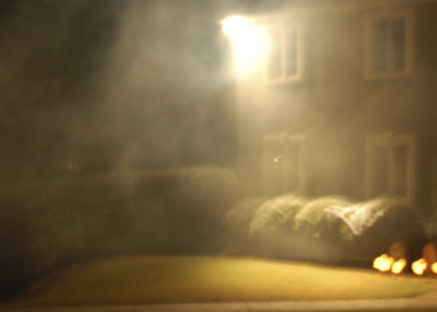
This picture was done Halloween night on my street. This is a picture of my neighbor's front yard and his fog machine. I could not catch the effect of the fog using a flash so I slowed down the shutter speed and shut off the flash. I think it turned out pretty spooky, tell me what you think!
Thursday, November 9
Halloween Night
Subscribe to:
Post Comments (Atom)


11 comments:
Did you use a tripod? There seems to be a slight shake looking at the lights. This will make the photo a bit blurry. I like that you made a solid effort - didn't just shoot the first thing you saw. This photo show evidence of planning as you said you took multiple photos with and without flash. What woudl happen if you cut out the bright light at the top but were able to take advantage of the light it produces on the ground. Your shutter speed might also change. Overall a nice job.
It's a simple shot, somewhat boring. The colours are bland and uninteresting.. I don't understand the appeal of this.
i think this could have been better. there isn't a lot of character to this picture. i agree, the fog does make it a little creepy, but to me it just makes it look a little blurry and i can't really tell what is in the picture. i think there is more potential for a photo like this.
-gillespie
I agree with myers about using the tripod, you cant see very much detail and I think that would help this shot. I do like the smokey look the air has and I like the darker color scheme. keep it up.
franklin
It seems a little fuzzy, try not to shake as much (or the tripod idea). Also if you could have done something to reduce the glare it would make it alot more visually appealing.
Bomer
it is pretty spooky but maybe use a tripod. it is a little blurry
I like the soft focus achieved by the slight blur...perhaps by motion but I think it might have been an intentional blur. Either way I think it adds to the image. The big bright hole in the top center is what is ruining the image for me. With night photography a tripod is essential and you should take care to avoid bright lights. The time it takes to expose your dark areas will blow out bright objects. Anyway I think it has potential as part of a photoshop collage using the right half for its spooky quality.
This picture is fantastically boring, dull, and lacking any and all shreds of what should consist of making a picture anything slightly above 'crap'. To start matters, the composition and overall idea of the picture is poor. Its great you wanted to capture the fog in a 'spooky' location but the light from the house blows out the light so much, that you have in effect created a horrible eye sore. The picture is blurry as well. You could have at least covered the flash with your hand or anything else that was available to at least make your picture a less, if not entirely blur-free, and you would have gotten the lightning that was available as well. The location for the picture is also poor, anyone with access to a camera could have shot this. Let alone someone with access to a camera with a neighbor with a flood light and some fog. But even without those elements you could have done these things in Photoshop and still have gotten better results. Also, the colors on this are bland, reminiscent of urine or some kind of toxic gas, and as I mentioned before, the light of the house blows out that portion of the picture. Sure, you could argue that the light and all of the aforementioned elements could be used to draw the viewer in and give them a sense of being 'spooked' and that the light will draw the viewer, only to further explore the rest of the image. But I could also argue that this image was taken because you didn't make an attempt to go out and shoot something half way decent. I could also argue that this picture wreaks of ugly.
looks cool
Joe mcdonald
Well, first of all I don't own a tripod, and second I wanted a little bit of blurriness in it. I could though edit out the light.
-Lindsay
this picture's kinda neat,well i don't really like the picture, i like the idea of the picture because i see what you're getting at. but i think the lighting should've definitely been different, perhaps not so yellow. maybe a red or something. and i don't like how it is blurry and nothing is in focus.
Post a Comment