Contributed by L Bates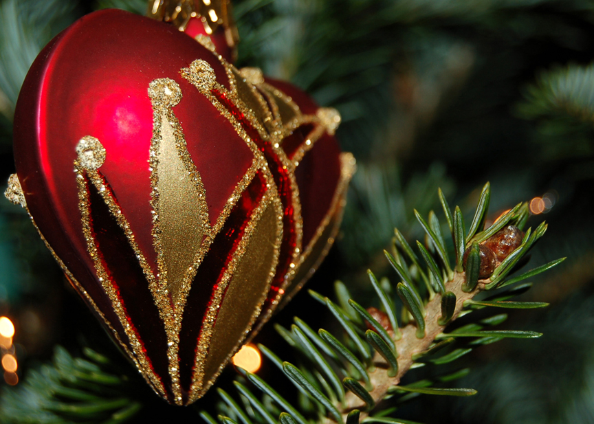
This picture was taken before Christmas of a heart ornament. I love the detail and the contrast in color, even the depth of field. Let me know what you think!
Monday, January 8
Untitled
Subscribe to:
Post Comments (Atom)

Contributed by L Bates
This picture was taken before Christmas of a heart ornament. I love the detail and the contrast in color, even the depth of field. Let me know what you think!


6 comments:
the shot woud be much better if the lighting were not so harsh, and more fitting to the objects in the image.
the shot woud be much better if the lighting were not so harsh, and more fitting to the objects in the image.
i like the detail. and the rule of thirds works for the character of the ornament. nice.
-gillespie
I really like this picture, I like how the contrast in colrs make the ornament pop out. I also like the detail in the tree branch it helps add to the photo.
i do agree with kirsten though, the rule of thirds does contribute to the uniqueness of the ornament. Contrast is nice in this picture too.
-Selman
I think is a good picture. I especially like the contrast and the depth. I also like the way the branch leads away and moves the eye around the image.
vail
Post a Comment