Contributed by A Ledbetter
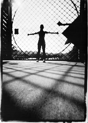
This was my second pinhole photo that I took for the pinhole assignment during class. I think this picture turned out really awesome because of all the different lines and shapes that the light basically created. The only think I did in photoshop with this photo was change it to black and white.
Wednesday, November 4
Gated
Subscribe to:
Post Comments (Atom)


17 comments:
This photo always catches my attention when scrolling through the scans on Bridge CS3. I really love the shadow of the gate on the ground in front. The only thing I dislike about the photo is the triangle in the top-right protruding into the photo - it's a bit distracting.
- sNb
I love this picture. I see it when i pull it up in bridge and im like oh that's really cool. love how the shadow on the ground looks.
SPHS CS
This is an amazing so sharp the leading lines coming across your subject is breath taking. when i first saw this picture it just made since but looking beeper it stands up to scrutiny.
I think this picture got the right amount of exposure but it would have been awesome with a digital camera.The person who too the picture did it at a great angle and the lines are so detailed.
-A.U SPHS
I really like this picture because of the shadow it created on the ground. It's very interesting. It turned out really good.
SR- SPHS
The leading lines in the picture are amazing, I also love the shadows in the picture they make the picture very interesting! Great picture!
First thing to say, this picture is extremely amazing. I love the way it is black and white. The shadows on the ground and the lines to it makes this pictures interesting. Also I love how the person is in the center, it makes the picture really awesome. And once again this picture is extremely amazing
K.U-SPHS
This is a really good photo considering it was taken with a pinhole camera. The shadows of the gate are great leading lines. I also like the angle the shot was taken and the pose of the model. Overall great job.
SPHS - AZ
I saw this picture scrolling through the scans and loved it! It looks really cool. The shadows from the gate on the ground make cool lines to look at. Great picture!
CT SPHS
I have to agree that this is one of the more amazing pinhole photos that I have had the pleasure to view.
I like the circle that emphasizes the figure and repeated squares from the gate and shadow that keeps my eye moving and give great linear perspective. I also like how there is a story... I can't tell if the figure if facing away or toward the camera. This makes the meaning elusive and adds to the image.
My only gripe is that you cropped off the top natural edge, it should be in the image like the other three. Definitely worth redoing before I enter it in the Birmingham Southern Art Show. Congrats on your great image.
I really like this picture. The contrast between black and white goes with the contrast between the outstretched arms (a symbol of freedom) with the gate (a symbol of captivity). This picture is very well done, and the exposure was perfectly timed when it was shot. I agree with Mr. Myers in regards to the border, but that can easily be fixed by either retaking the picture or just cropping out the other edges. Great job!
Neat shot! Looks like an album cover for a progressive metal band. I love the back and white on this, as usually I despise it. I love the lines on this, as they form on the ground that leads up to the girl/guy standing there.
How come my students can't take pinhole images like this?! Congrats--you've got a beauty! I agree with Mr. Meyers--you need that top edge back.
This photo just comes off the screen at you and I like the lines within the circle. Good exposure timing can go a long way, and this picture is a prime example. This is sort of the look I was trying to pull off with my pinhole, but mine did not turn out as good as this one did.
DC-SPHS
This picture is really eerie. It kind of reminds me of the Vitruvius man, drawn by Da Vinci. I also like that you shot this picture in black and white, and that you were able to get the person in this picture completely blacked out; I also love the position that the person is in. I think it is really neat that you were able to capture the pattern of the fence onto the sidewalk. Very cool picture.
- JNB
This reminds me of the movie Silent hill, that movie was prettys sweet just like this picture. I like how its in black and white and how i could make a comparision. In the end the last thing that i like is the shadows from the fence, its kind of creepy.
I like the angle of this picture, it makes the picture much more interesting. Plus the black and white makes the picture a little more mysterious then it would be in color. This picture has many different features that make it great! The lighting in the back offsets the darkness in the foreground, to create a full tonal range.
Post a Comment